Plugin
The viewer is shipped with native plugins but others can be added to add new features and more possibilities. A plugin is mainly either a Vuejs 3.x component or a simple function that is run once when the viewer is mounted into the DOM.
Registration and Plugin API
A plugin is added to the viewer by registering it :
import makeBIMDataViewer from "@bimdata/viewer";
import MyPlugin from "@myOrganisation/plugin";

const bimdataViewer = makeBIMDataViewer(/* {...} */);

bimdataViewer.registerPlugin(MyPlugin);
The registerPlugin method take a PluginDefinition object as argument:
| Property | Description |
|---|---|
name: string | Required The name of the plugin. Must be unique. |
component: object | A Vuejs (v3.x) component. |
i18nTokenPrefix: string | Default to plugin.name. Prefix to add before i18n tokens. |
i18n: object | An object containing translations for internationalization. |
startupScript: Function | A callback that is executed when the viewer is mounted and takes $viewer as argument. |
button: object | An object that describe the display of the plugin if the plugin is shown as button. |
window: Window | An Window configuration object used to register a window with this plugin in it. This plugin is automatically added to the window.plugins list. |
addToWindows: string[] | An array of window name in which to include this plugin. |
isViewer: boolean | Default to false. Defines if this plugin must be considered as a viewer. See viewer plugins. |
settings: object | An object with the corresponding options passed to the makeBIMDataViewer() method. |
Note that additional custom data are forward to the registered Plugin to let you configure your plugins as you need to.
Once registered, the plugin is available on the viewer with the same interface as the object used to register it.
Plugin instance
Once registered, the plugin is on the list of the registered plugins. But when a window is loaded with a particular plugin as a child, the resulting plugin is a plugin instance. A unique copy of the registered plugin, with additional APIs.
The Plugin Instance inherits all of the Plugin APIs. The additional APIs are the followings:
| Property | Description |
|---|---|
open: Function | Used to open the plugin as button component. Arguments are passed to the onOpen option API of the component. |
close: Function | Used to close the plugin as button component. Arguments are passed to the onClose option API of the component. |
isOpen: boolean | true if the plugin as button component is open. |
show: Function | Used to show the plugin component. |
hide: Function | Used to hide the plugin component. |
shown: boolean | true if the plugin component is shown. |
loading: boolean | true if the plugin component is being opened or closed. Used in case of async plugin as button component. |
componentInstance: object | The Vuejs 3.x component instance. |
buttonText: string | The text displayed on the plugin button. (getter & setter) |
To retrieve a plugin instance:
const myPluginInstance = localContext.pluginInstances.get("myPlugin");
// or
const myPluginInstance = localContext.plugins.get("myPlugin").$plugin;
Plugin Component Instance
A plugin component is a Vuejs 3.x component with some additional features.
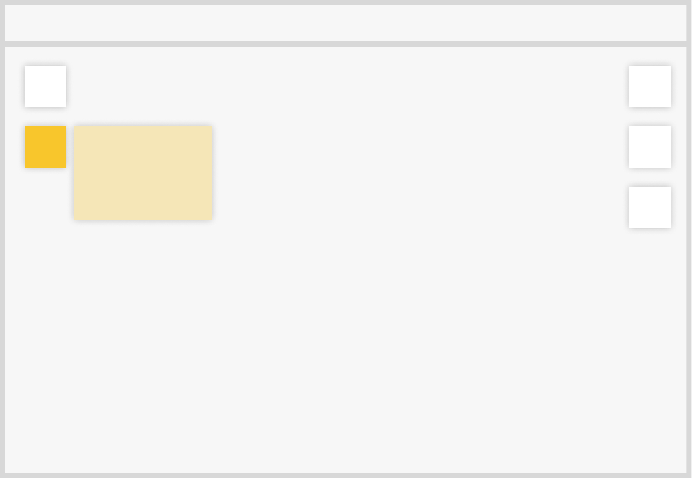
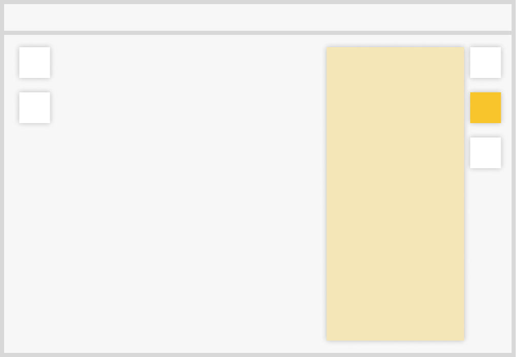
By default, a plugin component is displayed on the window content. (the orange area on the image below)
Some additional properties are natively available on the component instance: (this on computed, lifeCycles, methods...)
$viewer, the entry point of the BIMDataViewer internal API.$plugin, the entry point of the plugin API, a Plugin Instance.
WARNING
If a component uses the Vue.js composition API, $viewer and $plugin need to be injected.
setup() {
  const $viewer = inject("$viewer");
  const $plugin = inject("$plugin");

  // ...
}
For more convenience, some of the Plugin Instance APIs are available on the component instance, with a $ in front of it:
$show(): Function, afunctionto show the plugin component.$hide(): Function, afunctionto hide the plugin component.$open(): Function, afunctionto open the plugin component (plugin as button only).$close(): Function, afunctionto close the plugin component (plugin as button only).$isOpen: boolean,trueif the plugin component is open (plugin as button only).$loading: boolean,trueif the plugin component is opening or closing (async plugin as button only).$shown: boolean,trueif the plugin is shown.
To retrieve a plugin component instance:
const myPluginComponentInstance = localContext.plugins.get("myPlugin")Plugin as button
Another way to display a plugin component is as a button. To do so, when registering a plugin, the pluginToRegister.button object must implement the following interface:
| Property | Description |
|---|---|
position: string | "left" or "right". The position of the button in the window. |
stance: number | A number used to sort the plugin as buttons registered on the same side of a window. |
tooltip: string | A string that is displayed when the plugin button is hovered. It can be a key to be translated ex: "myPluginName.tooltip". |
content: string | "simple", "panel" or "free"(default). Different way to display the component when the button is clicked. |
keepOpen: boolean | Default to false. If true, the plugin stay open even if the user click away from it. |
icon.imgUri: string | An uri to an image for the button. |
iconOpen.imgUri: string | An uri to an image for the button when the plugin is displayed (open). |
If only the icon is defined, the corresponding image is always displayed on the button. A similar iconOpen option can be defined to display a different icon when the button is open.
Content
A plugin as button can be displayed in 3 different ways, defined by the plugin content property.
- simple : plugin content displayed close to its corresponding button, on a small panel.
- panel : plugin content displayed on the whole window height.
- free : plugin content displayed on the side of the button, without any layout. Its size is determined by its content.
Additional Component API
A plugin component will have an additional API if it is registered as a button.
onOpen and onClose
onOpen and onClose are two methods that can be added as options API on plugin component.
As their names suggest, onOpen is run when the user request the plugin to be opened, while onClose is run when the user request the plugin to be closed.
If they return a Promise, onOpen and onClose methods can prevent user from spam clicking a plugin button. Indeed, it will not be possible to the user to open or close the plugin if the returned Promise is not resolved.
const myComponent = {
  async onOpen() {
    await new Promise((res) => setTimeout(res, 1000));
  },
  onClose() {
    return new Promise((res) => setTimeout(res, 2000));
  },
  methods: {
    onClick() {
      console.log("clicked !");
    },
  },
  template: `
    <div>
      <button type="button" @click="onClick">Click me!</button>
    </div>`,
};
The result:
These methods are useful when an action needs to be awaited before the plugin can be opened or closed again.
TIP
The plugin can be opened or closed using the UI (by clicking) or programmatically using javascript.
$open and $close
A plugin can be opened or closed using the UI (by clicking) but you may want to do it programmatically using javascript. To do so, you can use $open or $close methods available on pluginComponentInstance.
Example: a plugin component opened at startup and that close itself after 2 seconds.
const myPluginComponent = {
  mounted() {
    this.$open();
    setTimeout(() => this.$close(), 2000);
  },
};
You can also provide any parameter you want when you call $open or $close. These paramters will be passed to the onOpen or onClose method respectively.
Example:
const myPluginComponent = {
  template: `
    <button @click="onClick">
      Click me
    </button>
  `,
  data() {
    return { count: 0 };
  },
  onOpen(msg) {
    console.log("open message: ", msg);
  },
  methods: {
    onClick() {
      this.$open(`count = ${this.count++}`);
    }
  }
};
startupScript
The startupScript option of the plugin registration API allows to register a function that is executed once the viewer is mounted into the DOM. The function has $viewer as parameter.
const myFunction = ($viewer) => {
  $viewer.state.hub.on("objects-selected", (objects) =>
    console.log("New objects are selected", objects)
  );
};

bimdataViewer.registerPlugin({
  name: "myPlugin",
  startupScript: myFunction,
})
i18n
It is possible to add internationalization for plugins.
Translate text
To add i18n files, use the i18n plugin property. To translate a text, use $t("pluginName.textKey").
Example:
const EN = {
  "textKey": "This text is in english.",
};

const FR = {
  "textKey": "Ce texte est en français",
};

const myPlugin = {
  name: "myPlugin",
  i18n: {
    en: EN,
    fr: FR,
  },
  component: {
    template: "<div>{{ $t('myPlugin.textKey') }}</div>"
  }
};
Set the viewer locale
To set the viewer language, use the locale property of the makeBIMDataViewer configuration object:
const viewer = makeBIMDataViewer({
  locale: "en",
  // ...
});