Skip to content

Documentation
Go from idea to integration: guides, APIs, and examples.
How Can We Help?
Here are a few items we think might help you get started faster with BIMData.io depending on your needs.

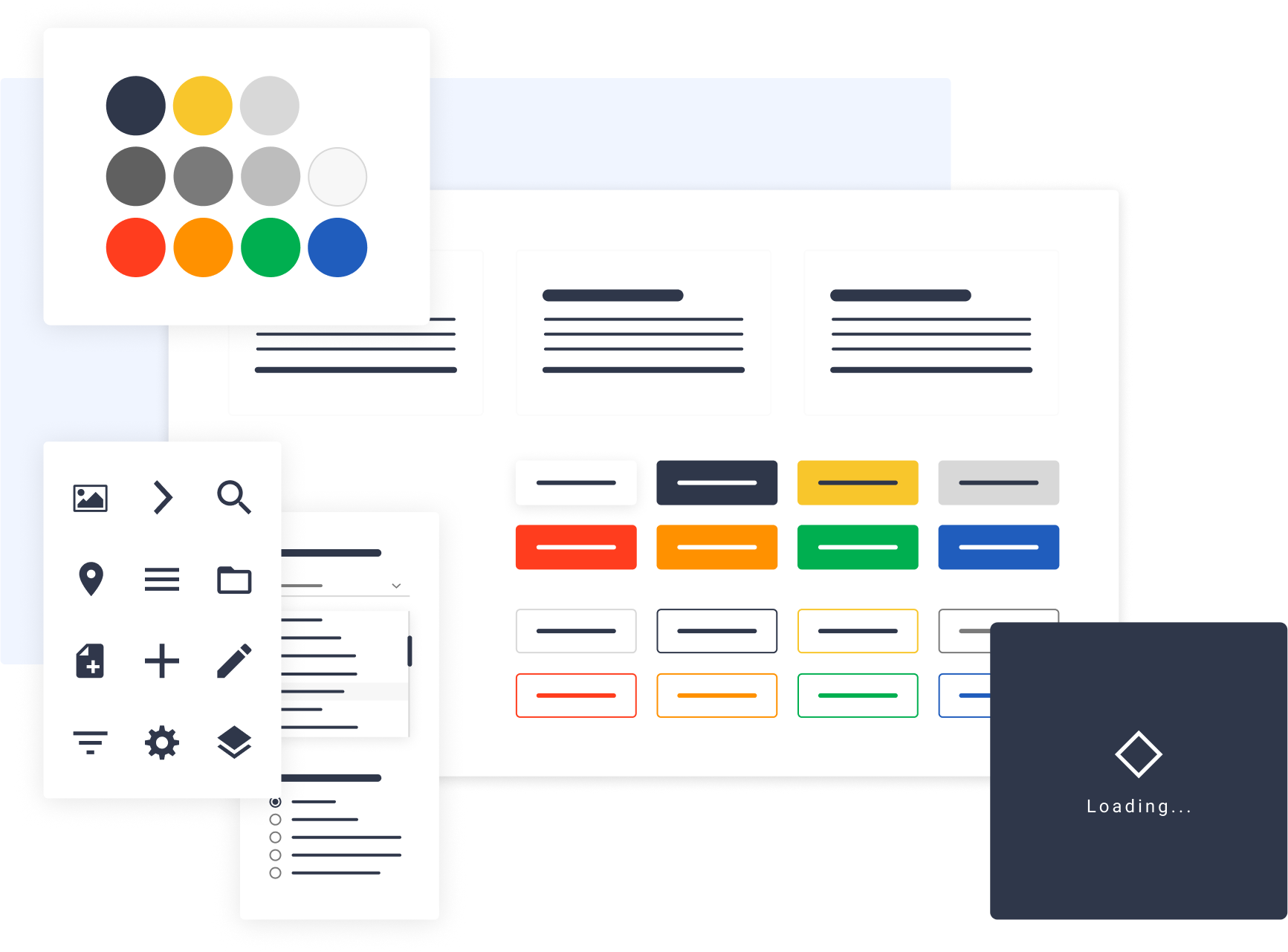
Design System
We have developed a Vue.js library that contains a set of components and demos for building interactive user interfaces. It is composed of UI patterns and components, typography, colours and associated tools, iconography, functional elements/components. All this is made available to developers to create plugins faster with a unified design.
Do you have a question ?
We're always here to help. Check out our support, contact our super helpful support team.
Your data will be treated in accordance with our Privacy Policy , which sets out the rights you have in respect of your data.